Trim Component
Getting Started#
The below code will give you the full Trim Component within your application to play with.
note
type="disabled" only disabled processing, that is when you press the done button.
The rest of the component is fully fucntionally
You can find an interactive demo at api.modfy.video/components
Processing#
You can learn the basics of processing here
Specific to the Trim component, the callback function in other(change to manual) mode is:
You can use this to manually trim the video if you want to
Themes#
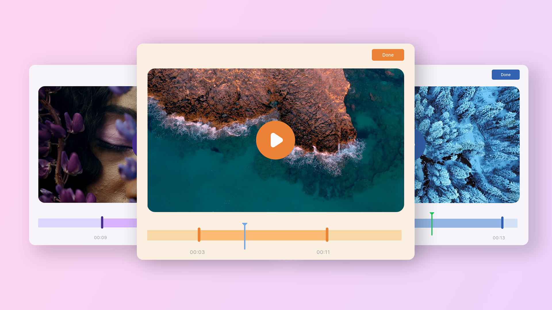
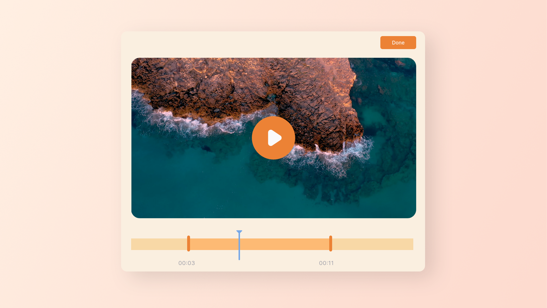
Examples of themes are shown below


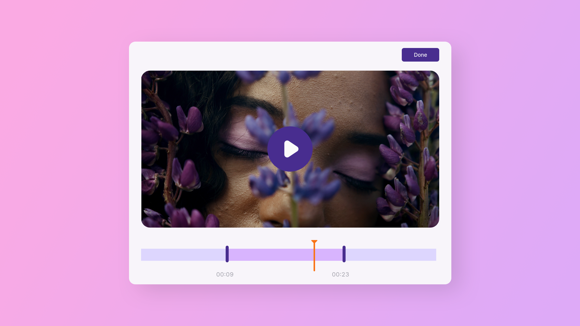
Light Themes#
- Autumn
- Amethyst
- Lapis


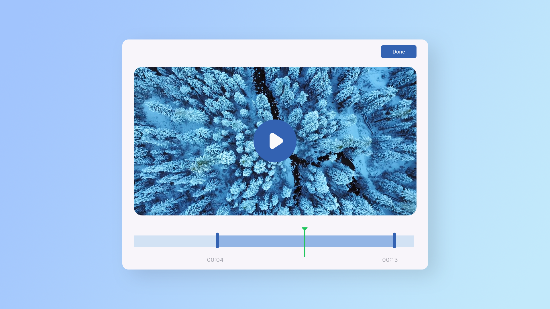
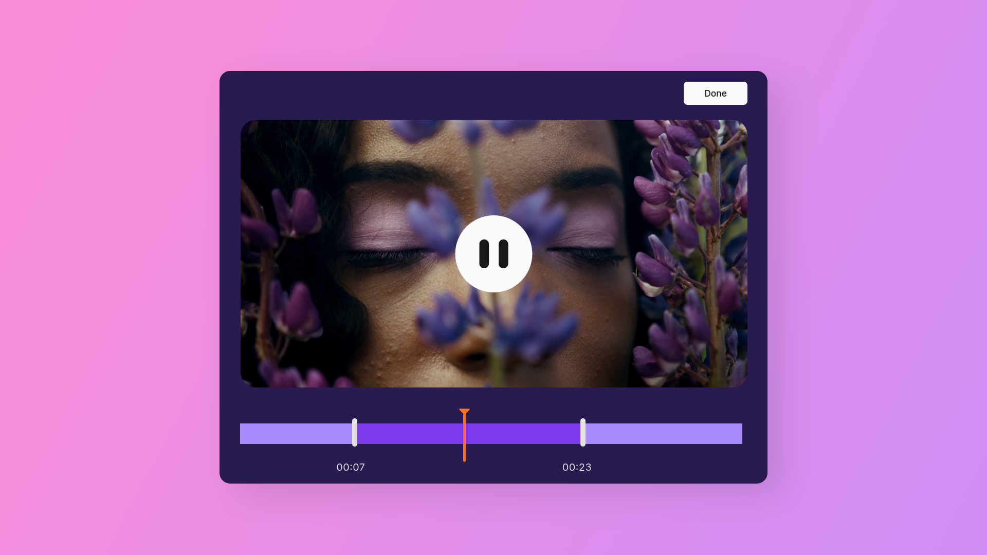
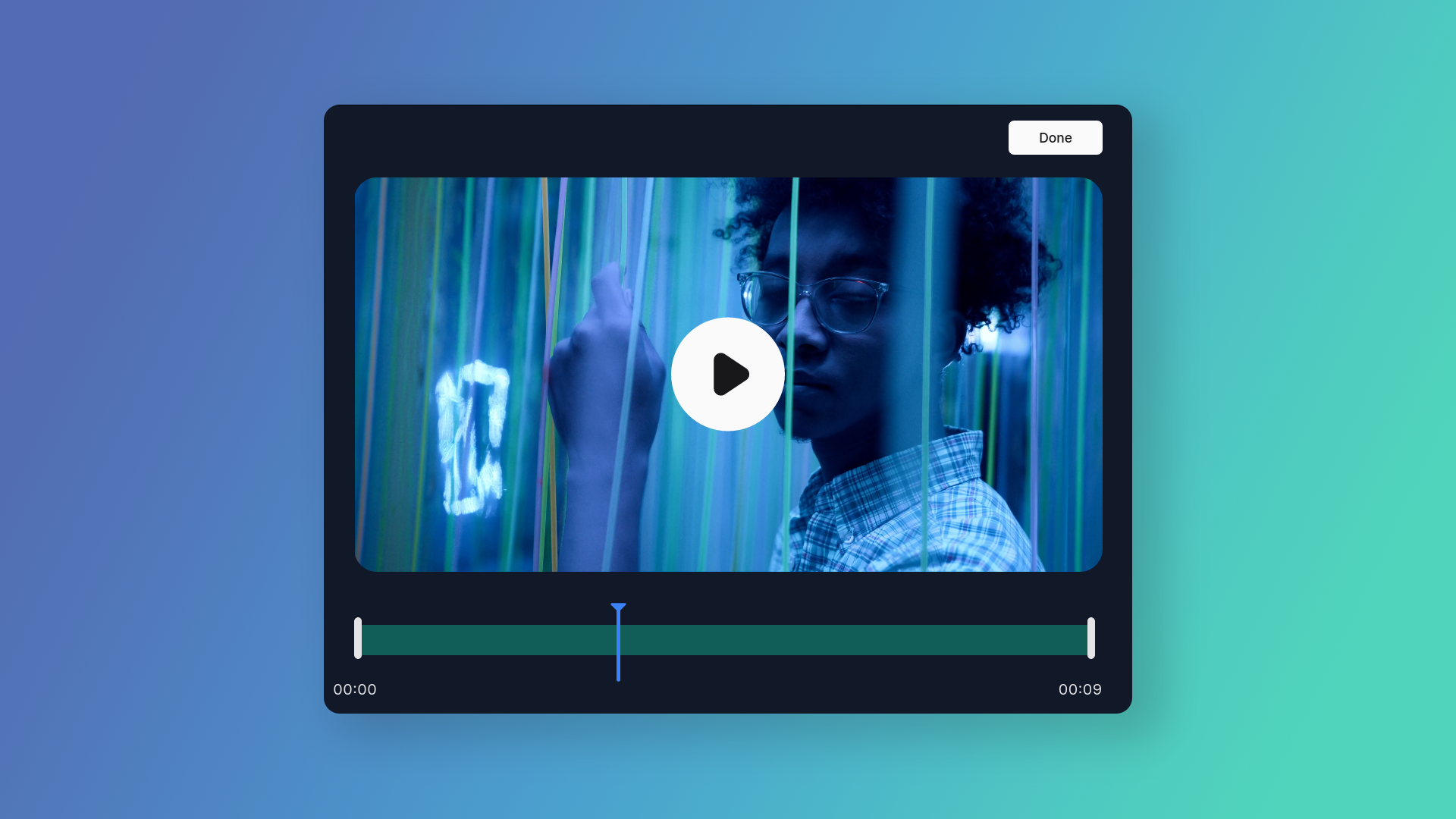
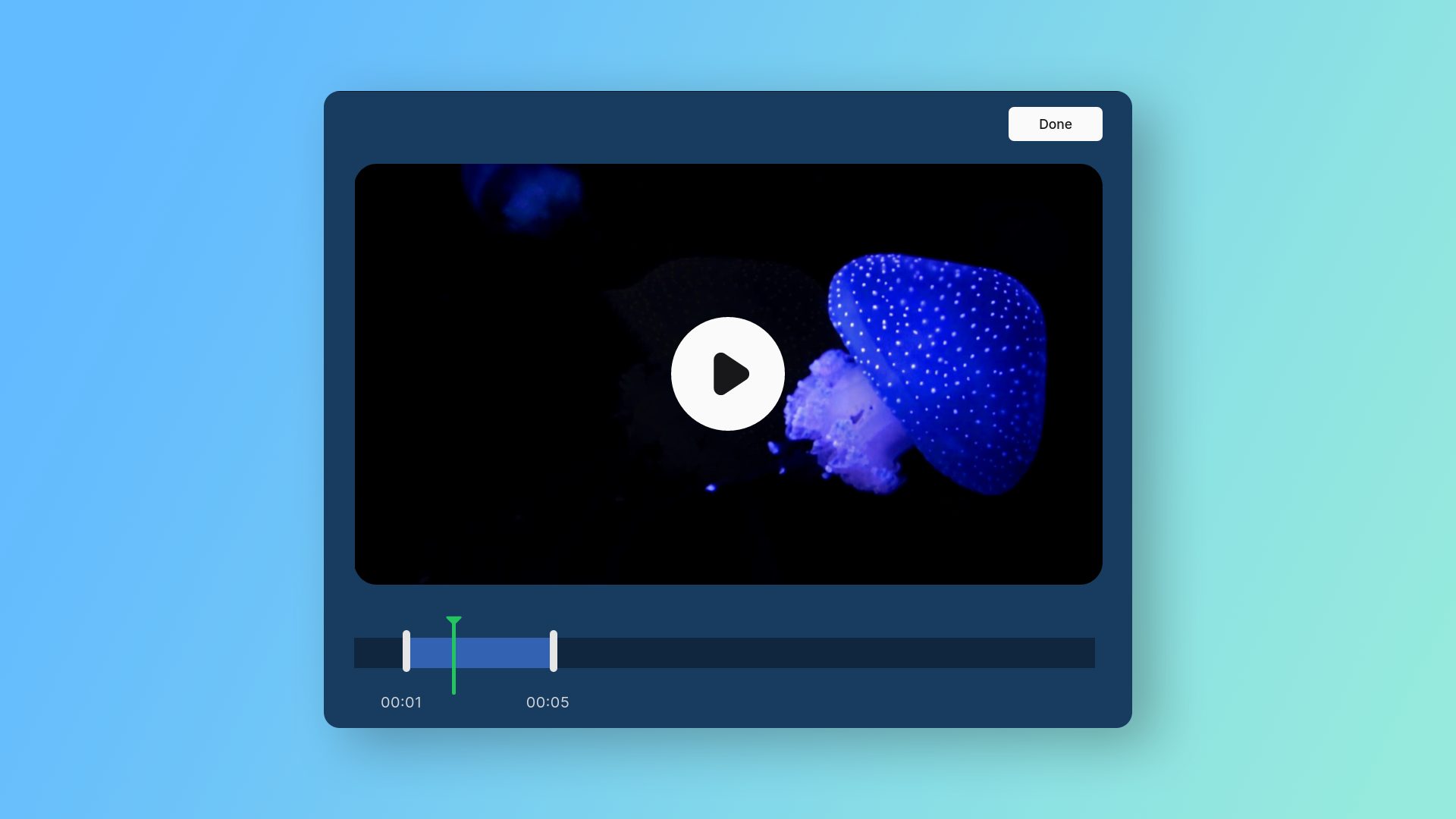
Dark Themes#
- Atlantis
- Amethyst Dark
- Lapis Dark


Custom Themes#
You can easily customize the color of all the elements using custom themes
- Extend a theme you like or defaultTheme
- Update the colors you want to change
- Use theme
These are the following properties you can customize in your themes
Customization#
The below are the full range of customizable properties for style.
textThe text object just contains the text you can edit or modifyfontBy default, the font used isInteryou can overwrite it and useinherit
An example of some basic customization would be